
# Data Manipulation
yc_clean = yc %>%
  mutate(Date = ymd(Date)) %>%
  mutate_at(vars(Date), funs(year, month, day))
# Initial EDA
yc_clean %>% ggplot(aes(x= Date,y=SPREAD)) + geom_line(color = "blue") + labs(title = "Spread over time") + theme(plot.title = element_text(hjust = 0.5))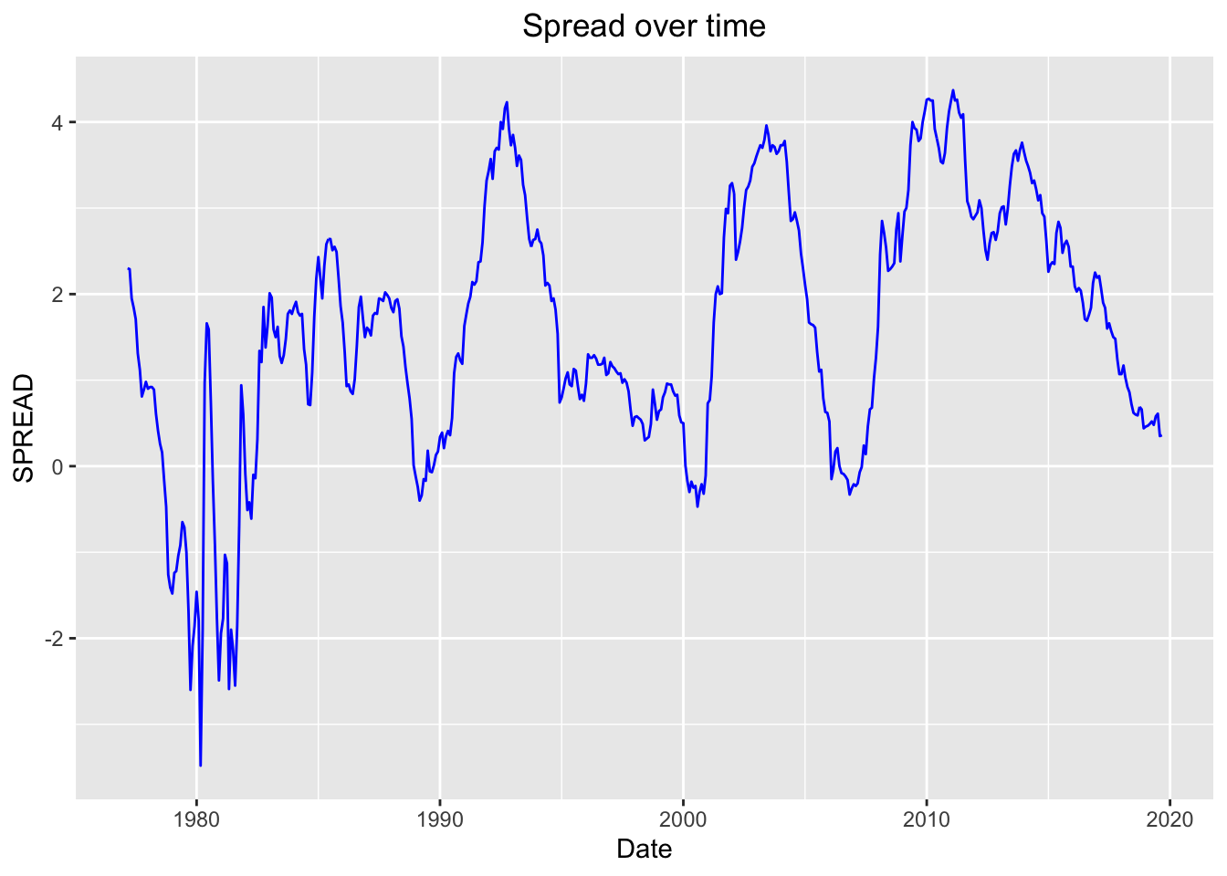
During times of recession the spread, which is the difference between the 30 year and 1 year maturity, yields a negative value. The years following a recession we see the economy head into expansionary periods where the spread yields positive values. Another insight is the growth of the United States economy appears to be segmented into 5-10 year periods of a healthy period or an unhealthy period. Another point to be made is the economy falls quickly but takes a longer time to recover.
The “Spread” line graph has a lot of volatility, which is slightly unexpected. We see a lot of ups and downs throughout time periods, followed by a big dip below 0 around the 1980’s and shallow dips during modern economic recessions. We expected these dips during the modern economic recessions to also be deep but obviously not as deep as the 80’s. The recovery periods following the declines of 2002 and 2008 had a relatively fast rate of recovery, but the rate at which the spread declined from 2005 to 2008 much faster compared to that of the decline from 2010 to 2020, where the decline was steady.