
# Data Manipulation
yc <- yc %>%
  mutate(Date = ymd(Date)) %>%
  mutate_at(vars(Date), funs(year, month, day))

# Changing Col names
colnames(rgdp)[colnames(rgdp) == "A191RL1Q225SBEA"] <- 'RGDP'
colnames(rgdp)[colnames(rgdp) == "DATE"] <- 'Date'
colnames(UE)[colnames(UE) == "DATE"] <- 'Date'
colnames(rec_indicator)[colnames(rec_indicator) == "DATE"] <- 'Date'
colnames(rec_indicator)[colnames(rec_indicator) == "JHDUSRGDPBR"] <- 'rec'

# Joining Datasets
temp <- yc %>% inner_join(rgdp, by = "Date")
temp2 <- temp %>% inner_join(UE, by = "Date")
df <- temp2 %>% inner_join(rec_indicator, by = "Date")
# create column to write "yes" for recession and "no" if no rec
df$rec_char = ifelse(df$rec == 0, "No", "Yes")
# Creating Figure
df_2 = df %>%
group_by(year) %>%
mutate(mean_spread = mean(SPREAD, na.rm = T),
mean_urate = mean(UNRATE, na.rm = T),
mean_rgdp= mean(RGDP, na.rm = T))
df_p = df_2 %>% select(year,mean_spread, mean_urate, mean_rgdp, rec_char) %>% unique()
ggplot(df_p, aes(mean_urate, mean_spread, color= factor(rec_char), label = year)) +
geom_point(color = "red") +
scale_color_manual(values = c("darkgreen", "blue")) +
ggrepel::geom_text_repel(key_glyph = "rect") +
labs(title = "Recession Relationship",
x = "Unemployment Rate",
y= "Spread",
color = "Recession?") +
theme_classic() + theme(plot.title = element_text(hjust = 0.5))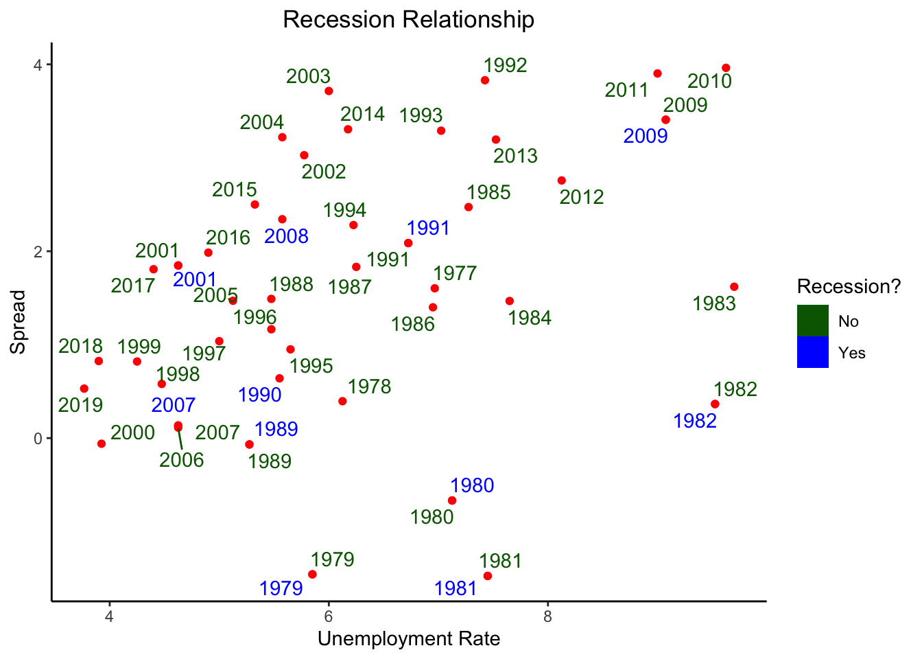
This plot kind of shows that there is a semi-linear relationship between the Spread & unemployment rate, but in recessions this relation kind of disappears.